
Blog Post by: Allie Duggan
There is not one aspect of life where color is an afterthought. It may seem like an insignificant choice, but it is so incredibly powerful and has the ability to accomplish so much. For 21 years, the Pantone Color Institute has announced the, “Pantone Color of the Year” on December 1stfor the upcoming year. This choice in color has become a trendsetting influencer in many global industries including fashion, home decor, packaging, and of course, graphic design. Not only does it affect industries, but it can have a major psychological and spiritual impact as well.
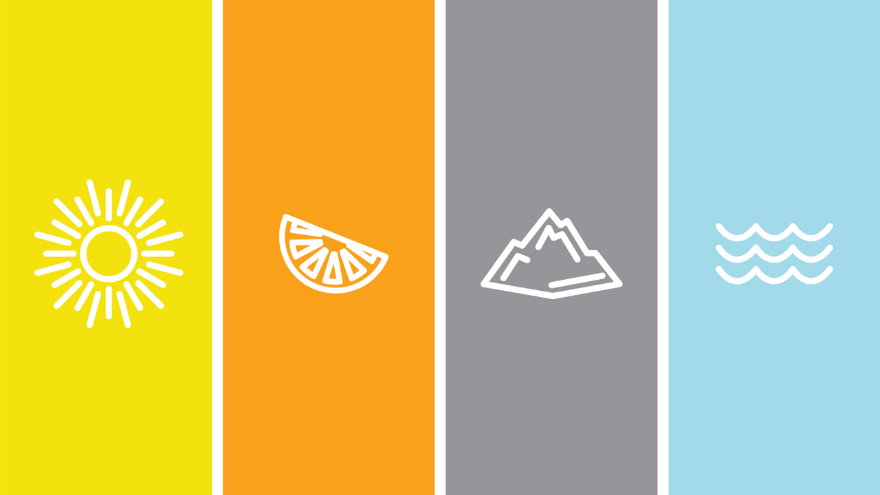
Hues and shades of blue can evoke emotions of peace and tranquility. That subconscious link is drawn from nature, such as the subtle blue sky or the quiet trickle of water. It is for this reason you might choose blue in a bedroom or bathroom for a calming and serene retreat after a busy and chaotic day. A cool tone like blue can also serve as a place to rest your eyes in a design layout that is busy or full of patterns. Providing a place for consumers to take a break from communication allows them to digest all of the information.
On the other end of the spectrum, orange is an energizing color that can make you feel happy and uplifted. If you literally think of peeling open an orange, you are hit with a zing of citrus and I don’t think it’s a coincidence that the use of the color orange does the same; it creates a buzz. If your living room is missing a pop of color, orange is perfect in the form of an overstuffed chair, a fuzzy blanket, or throw pillows. This can help to warm up and bring excitement to the room, perfect for a space you would entertain in. With its attention-grabbing quality, it is no surprise that this is a go to on a page full of information to help guide your eye to the most important message.
Color goes far deeper than influencing design industries, though. The year 2020 was a heavy for a multitude of reasons, which is why 2021 is the world’s year for hope and healing, and in true fashion, Pantone has chosen colors that represent just that. The 2021 Pantone colors are Ultimate Gray 17-5104 and Illuminating 13-0647. The two are yin and yang, which bring a much-needed balance to the uncertain world we are living in today. Ultimate Gray symbolizes strength and resilience, and Illuminating symbolizes brightness and positivity. These colors come together and complement each other to give a solid foundation of hope, exactly what the human spirit needs in this year!
The opportunities with color are endless, and these examples only scratched the surface. Color has a huge impact in all aspects of life, and when chosen with purpose, can make a world of difference.