
Blog Post by: Allie Duggan
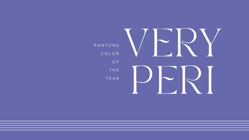
New year, new color! It’s that time again and Pantone has spoken. Typically Pantone will choose a color from their existing library, it’s extensive so it gives them a lot to choose from, but they did things a little different this year. For 2022 they have invented PANTONE 17-3938 Very Peri. As the name implies, it is a shade of periwinkle. This bold choice to create a whole new color is indicative of all things new that are emerging this year in all aspects of life, technology and trends. Veri Peri has big things in store. This shade represents inventiveness and creativity and it can be very powerful when it comes time to set intentions through the rest of this year.
If we look back at 2021’s Pantone colors of the year, they were Ultimate Gray 17-5104 and Illuminating 13-0647. These colors were a symbol of strength and hopefulness, which was fitting coming after the struggle of 2020. Some may say that 2021 gave us two colors, rather than one because we just needed a little extra after the heavy year of 2020. Veri Peri stands alone with a strong mixture of blue and red. The loyalty and reliability of blue combined with the vitality and spirit of red give birth to a color that evokes comfort and vigor all in one.
We are now a few months into 2022 it is fitting that Very Peri is a symbol of inventiveness and creativity. I don’t think anybody is a stranger to becoming inventive in doing things differently and coming up with creative ways of living a “normal” life through a pandemic and that is here to stay. “As we emerge from an intense period of isolation, our notions and standards are changing, and our physical and digital lives have merged in new ways. Digital design helps us to stretch the limits of reality, opening the door to a dynamic virtual world where we can explore and create new color possibilities. With trends in gaming, the expanding popularity of the metaverse, and the rising artistic community in the digital space PANTONE 17-3938 Very Peri illustrates the fusion of modern life and how color trends in the digital world are being manifested in the physical world and vice versa.” Leatrice Eiseman, Executive Director of The Pantone Color Institute
The creation of a new color for 2022, versus choosing an existing color, reflects the expansive possibilities ahead of us. It wipes the slate clean and makes way for a fresh start, exactly what is needed right now. Periwinkle, and its properties as blue and violet mixed together, opens up a world guided by our intuitions instead of doing things the same old way they have always been done. It inspires you to look deep and align your goals with your emotions. Doing this acts as a catalyst to bring your dreams to life this year!